Visualizing DePaul’s enrollment trends.

A dynamic, interactive platform that makes student data accessible, actionable, and easy to explore.

Laptop screen displaying DePaul University Freshman Admission Summary 2018. Blue header with university logo, white text box below detailing admissions message.

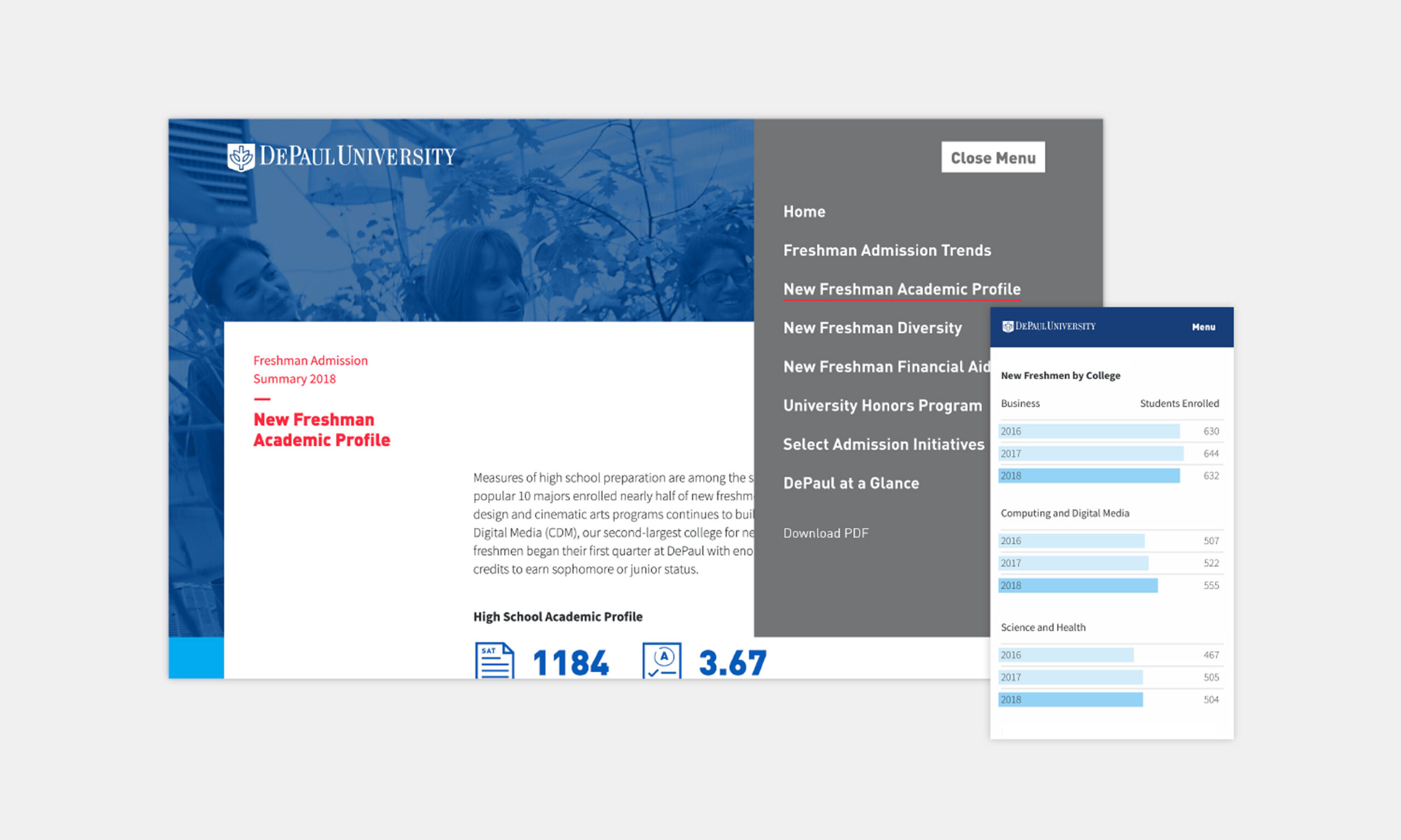
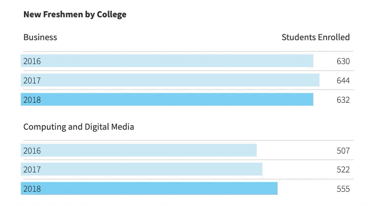
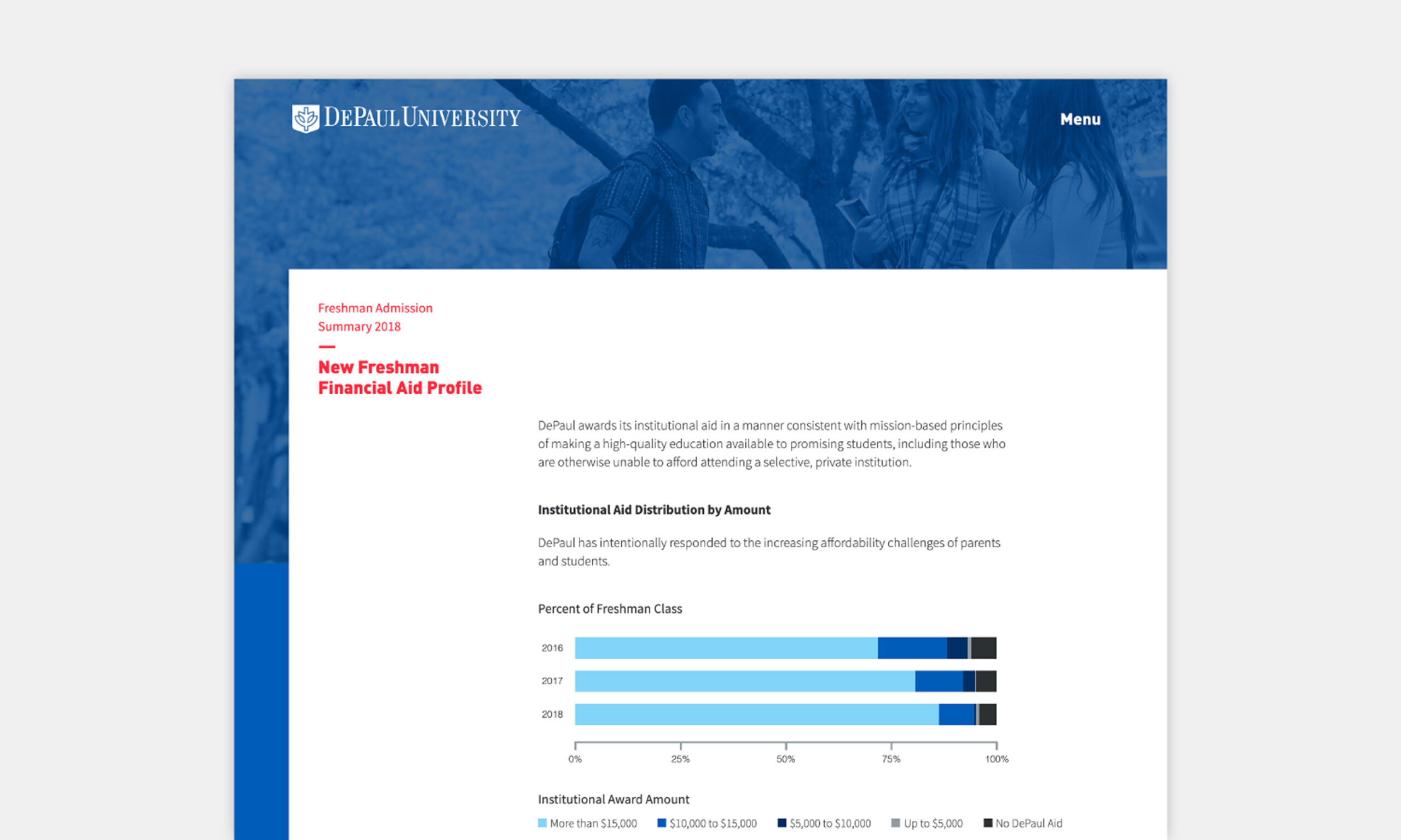
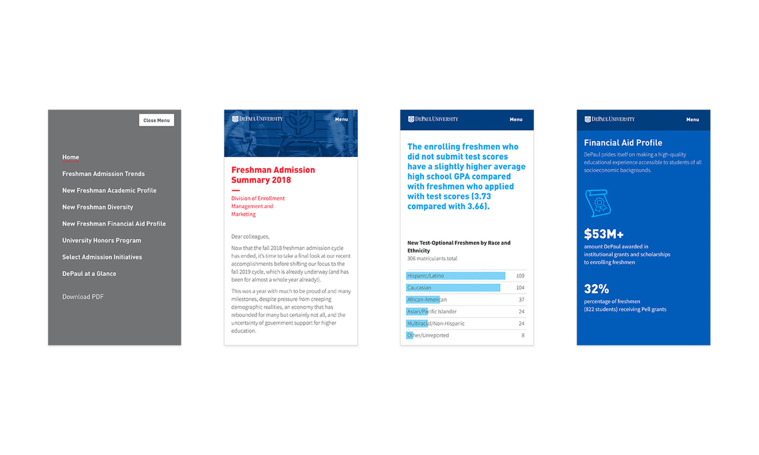
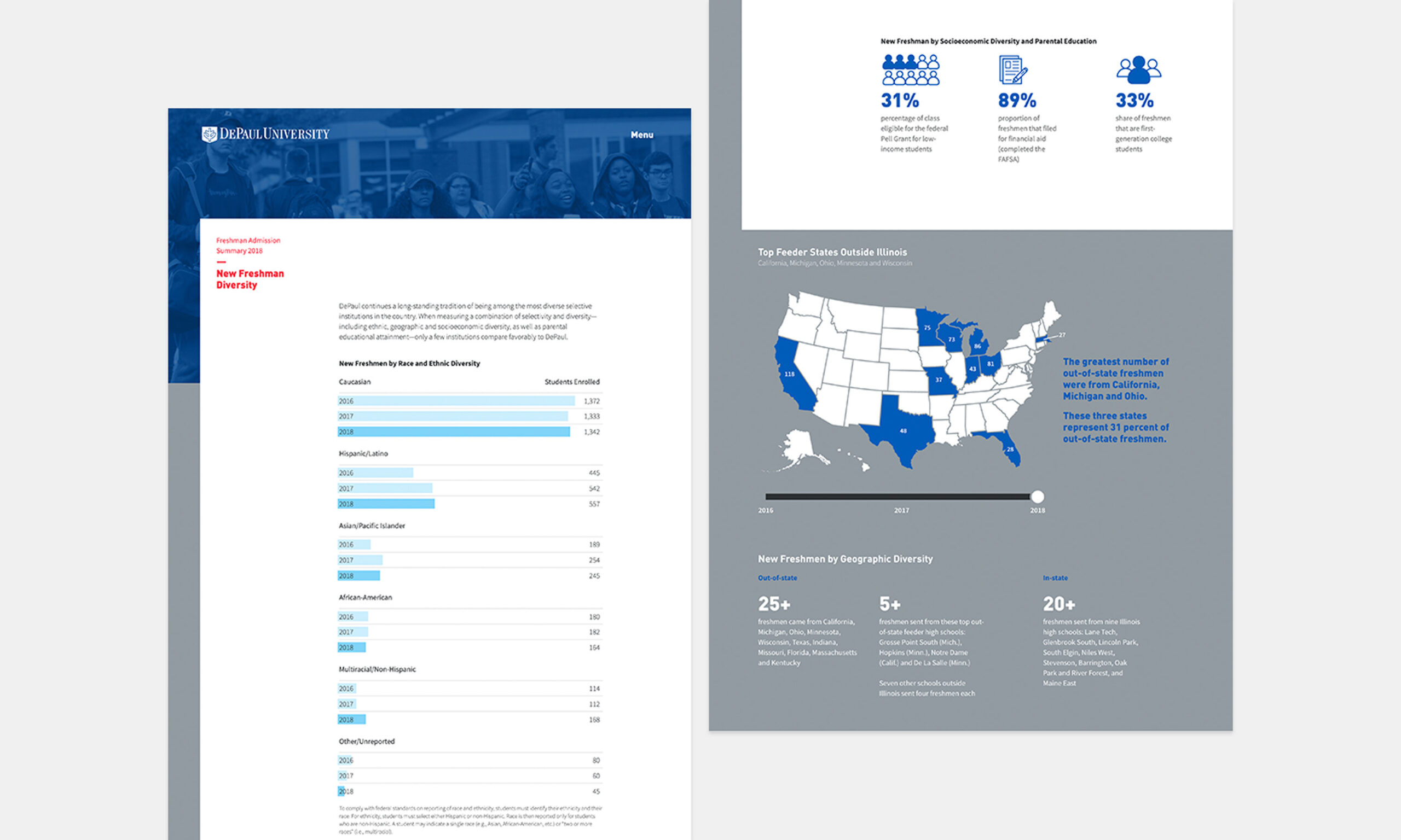
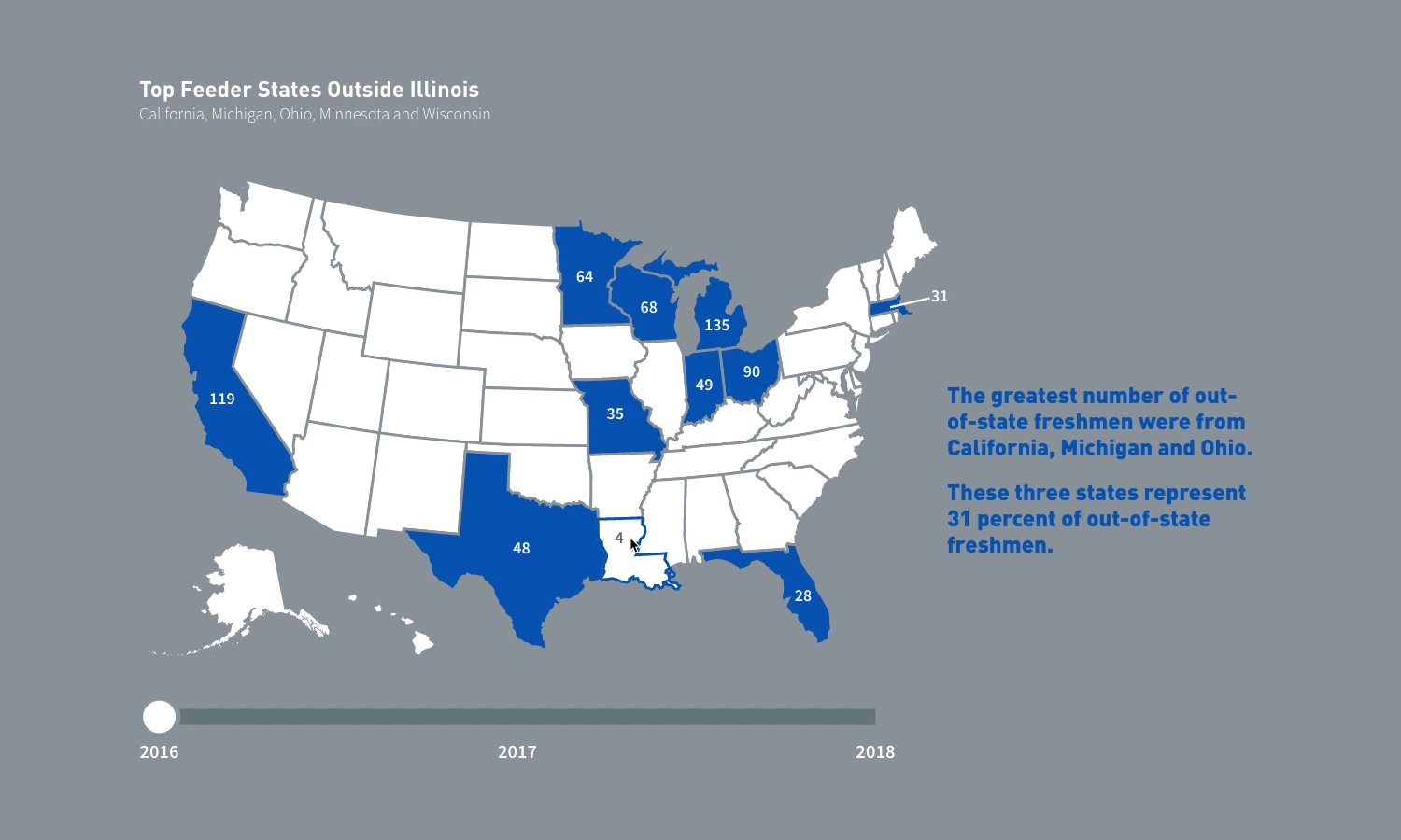
We partnered with DePaul’s Division of Enrollment Management and Marketing to transform and complement their traditional static freshman enrollment report into an interactive, CMS-powered digital experience. The platform made it easy to explore trends in academics, diversity, financial aid, and feeder markets. At the same time, the robust content management system allowed annual updates to be handled seamlessly in-house. This digital transformation not only streamlined reporting but also enhanced accessibility and engagement for users navigating complex enrollment data.

Infographic from DePaul University titled "Freshman Admission Trends." It shows bar and line graphs of application, enrollment, and admission rates from 2014-2018. Key stats: 27% from Chicago, 28% from suburbs, 43% from outside Illinois. Details: 1,616 international applicants, 60/40 gender ratio, over 5,000 high schools represented, 3,711 applicants with perfect GPAs.
DePaul University webpage showing the New Freshman Academic Profile for 2018, highlighting an average SAT score of 1184 and GPA of 3.67. The page includes a navigation menu and a chart displaying student enrollment by college within Business, Computing and Digital Media, and Science and Health.
GIF animation of New Freshman by college showing the years 2016 through 2018, the number of students enrolled for Business and Computing and Digital Media
DePaul University webpage on 2018 freshman financial aid. Includes a bar graph showing institutional aid distribution by year with blue segments. Header features the university logo.
Four-panel image showing university admission data. Left: menu with options. Center-left: 2018 admission summary. Center-right: data on GPA and test scores. Right: financial aid details.
Infographic detailing DePaul's Pathways Program in Health Sciences. Key statistics: 4.1 average GPA, top 10% nationwide test scores, and 31% first-generation college students. Highlights include a 20% increase in enrollment to 144 students, with 28% from outside Illinois and 51% being American students of color.
Bar chart showing popular majors for new freshmen: Film and television leads with 213 students, followed by accounting at 145. The freshman class's average GPA is 3.67.
DePaul University infographic highlighting new freshman diversity. Left panel shows student enrollment by race with a bar chart. Right panel includes a map of the U.S. indicating top feeder states in blue and diversity statistics such as 31% first-generation college students.

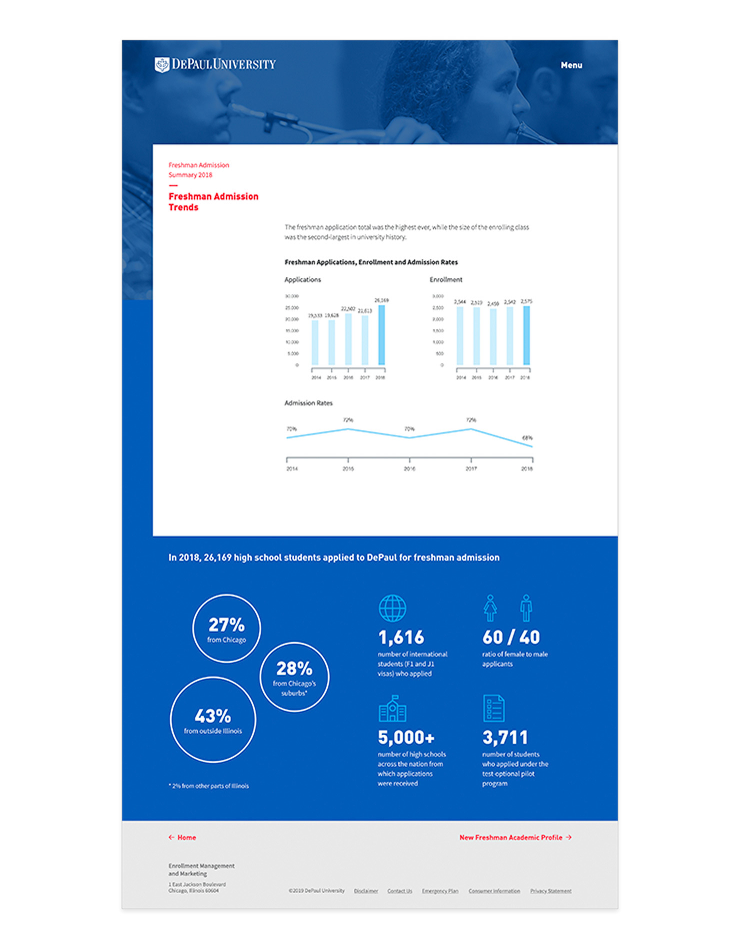
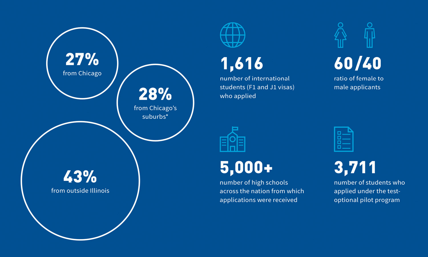
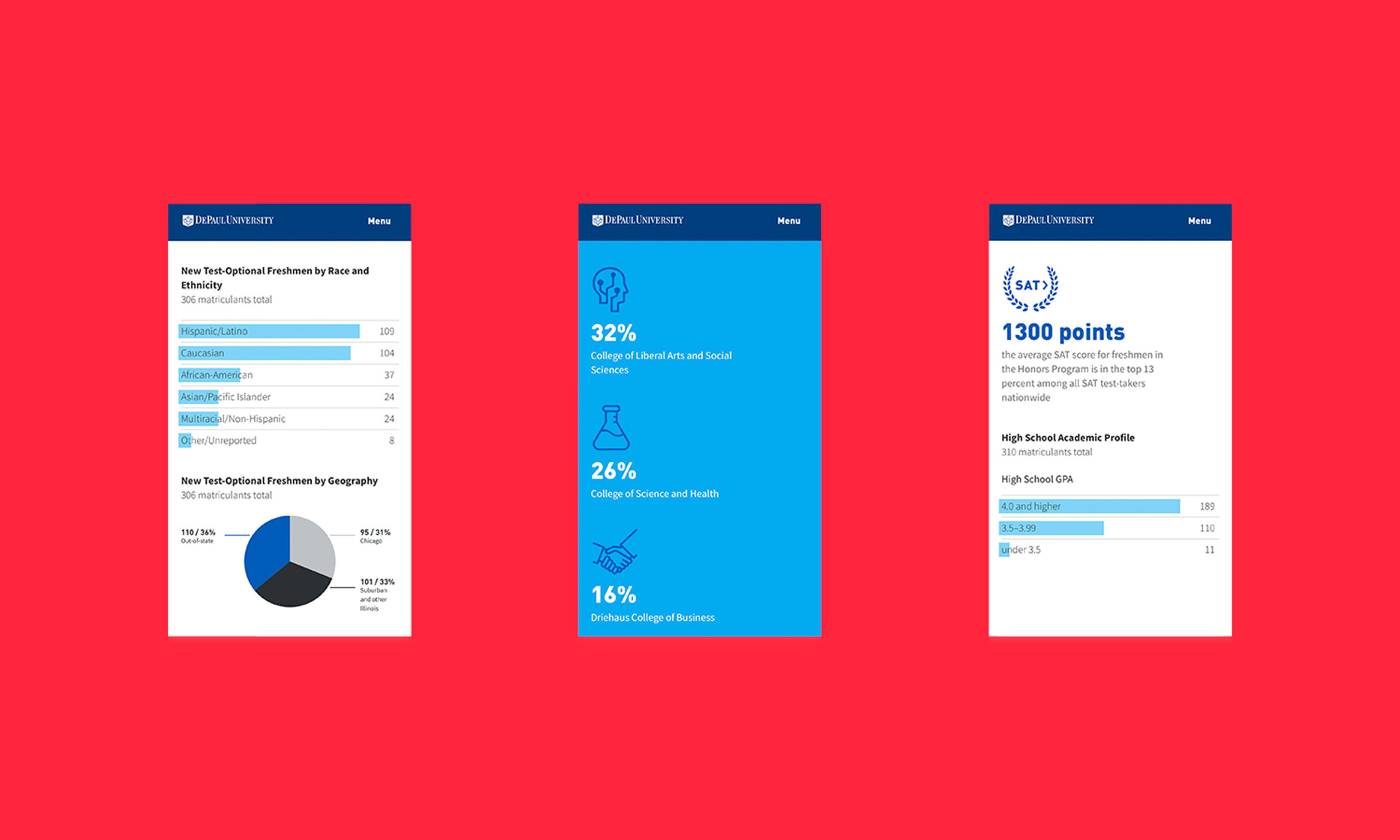
By consolidating key data points and visualizations, these publications support strategic planning, inform university leadership, and enhance transparency for both internal and external audiences.

Interactive GIF of The Top Feeder States Outside Illinois
Icons for the data driven freshman enrollment for DePaul University
DePaul University webpage displaying freshman admission summary for 2018. It includes enrollment statistics and faculty details on a clean, white background. Blue header features a university logo and menu.

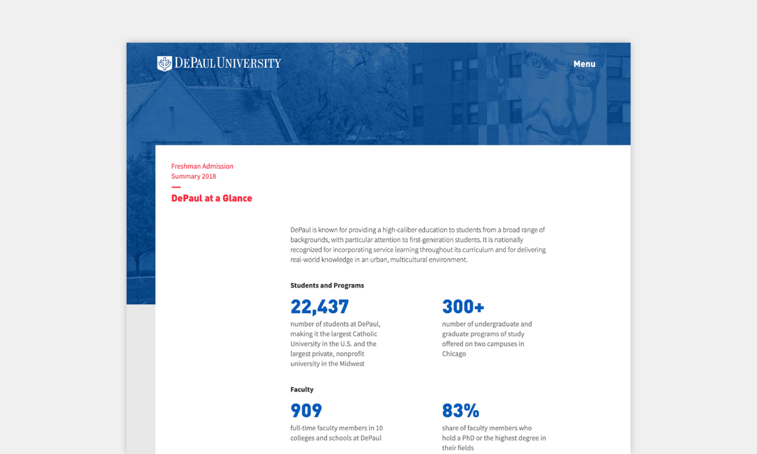
The combination of narrative summaries and engaging infographics makes complex enrollment information accessible and actionable, highlighting shifts in the student body and emerging opportunities for recruitment and retention. Together, these reports provide a clear, comprehensive view of DePaul University’s enrollment profile, offering valuable insights into student demographics, admissions patterns, and overall enrollment trends.

Blue infographic showing student application data: 27% from Chicago, 28% suburbs, 43% outside Illinois, 1,616 international students, 60/40 female-to-male ratio, 5,000+ high schools, 3,711 test-optional applicants.
Three infographics on a red background. Left: Bar and pie charts on race, ethnicity, and geography. Center: Percentages for university colleges. Right: SAT score and GPA details.