Chicago Children’s Theatre / Campaign Strategy and Identity

Curiosity, courage, and adventure since 2005.

Since its founding in 2005, Chicago Children’s Theatre has been dedicated to providing professional, year-round children’s programming. Programming sought to enrich the community with diverse, educational, and theatrical offerings that engage and inspire wonder in all of us. Multiple was invited to design this milestone identity to embrace their dynamic past and vibrant present while setting the stage for future aspirations.

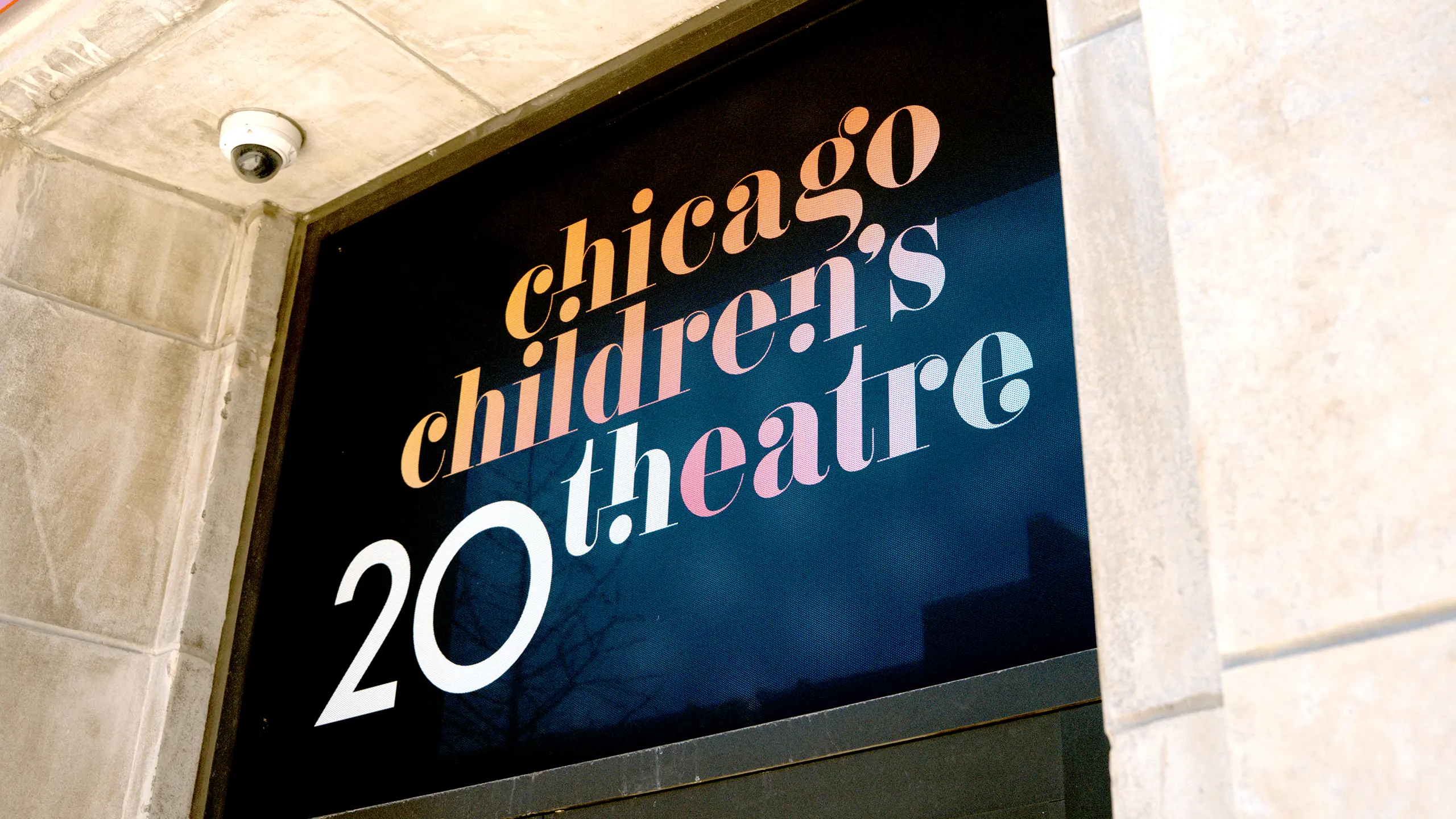
Building on the established, beautiful Chicago Children’s Theatre’s identity, the 20th logo was a natural fit to showcase the curiosity, courage, and adventurous spirit of those involved with the theatre over the years.

20th anniversary image for Chicago Children's Theatre. Two people creatively form the zeros, one with binoculars and the other smiling, against a black background.
A set of six commemorative buttons celebrating 20 years of a theater. Designs feature phrases like "20 Years in the Making" and vibrant gradient colors.
Two vertical banners on a lamppost celebrate the Chicago Children's Theatre's 20th anniversary. One shows a fox in a coat, and the other features text on a bright yellow background.
Black hoodie on hanger against brick wall, featuring “Chicago Children’s Theatre 20th” in colorful text.

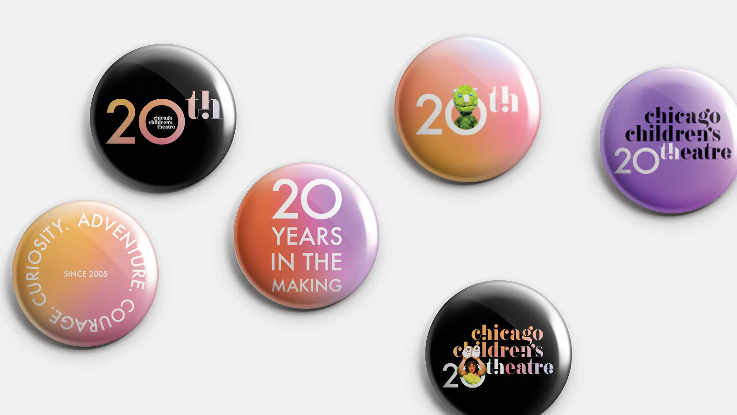
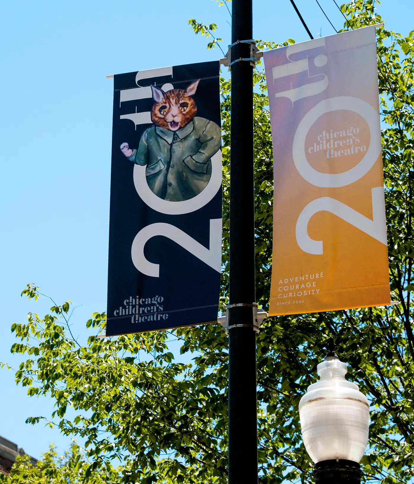
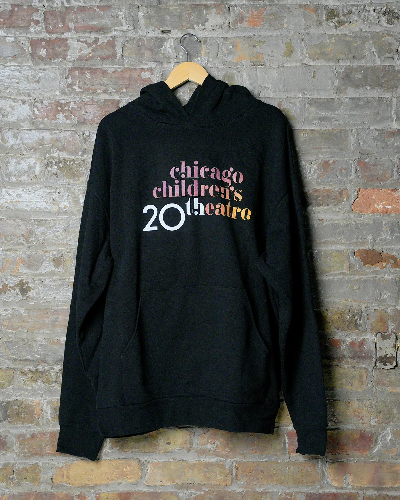
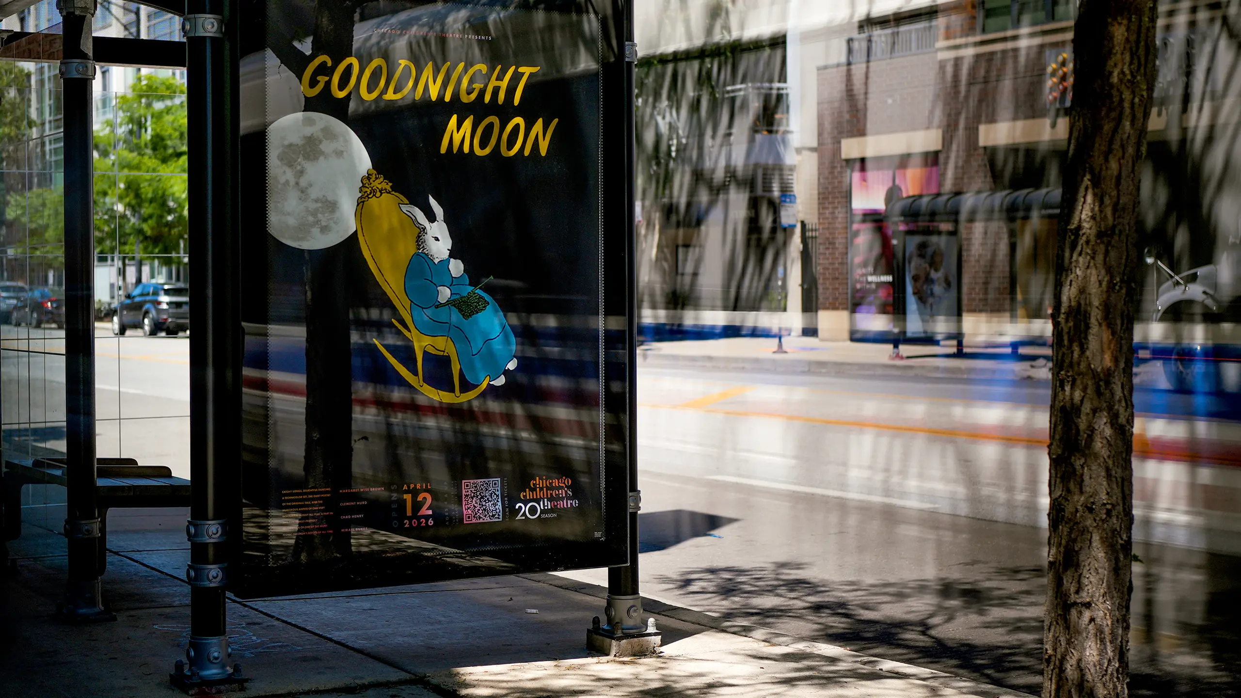
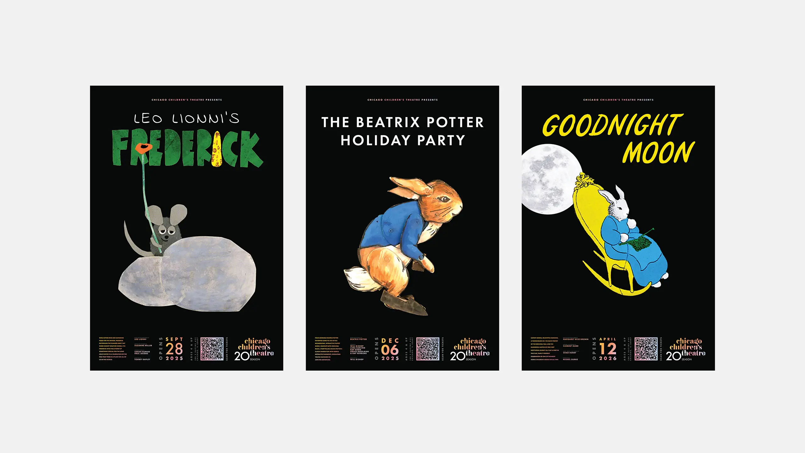
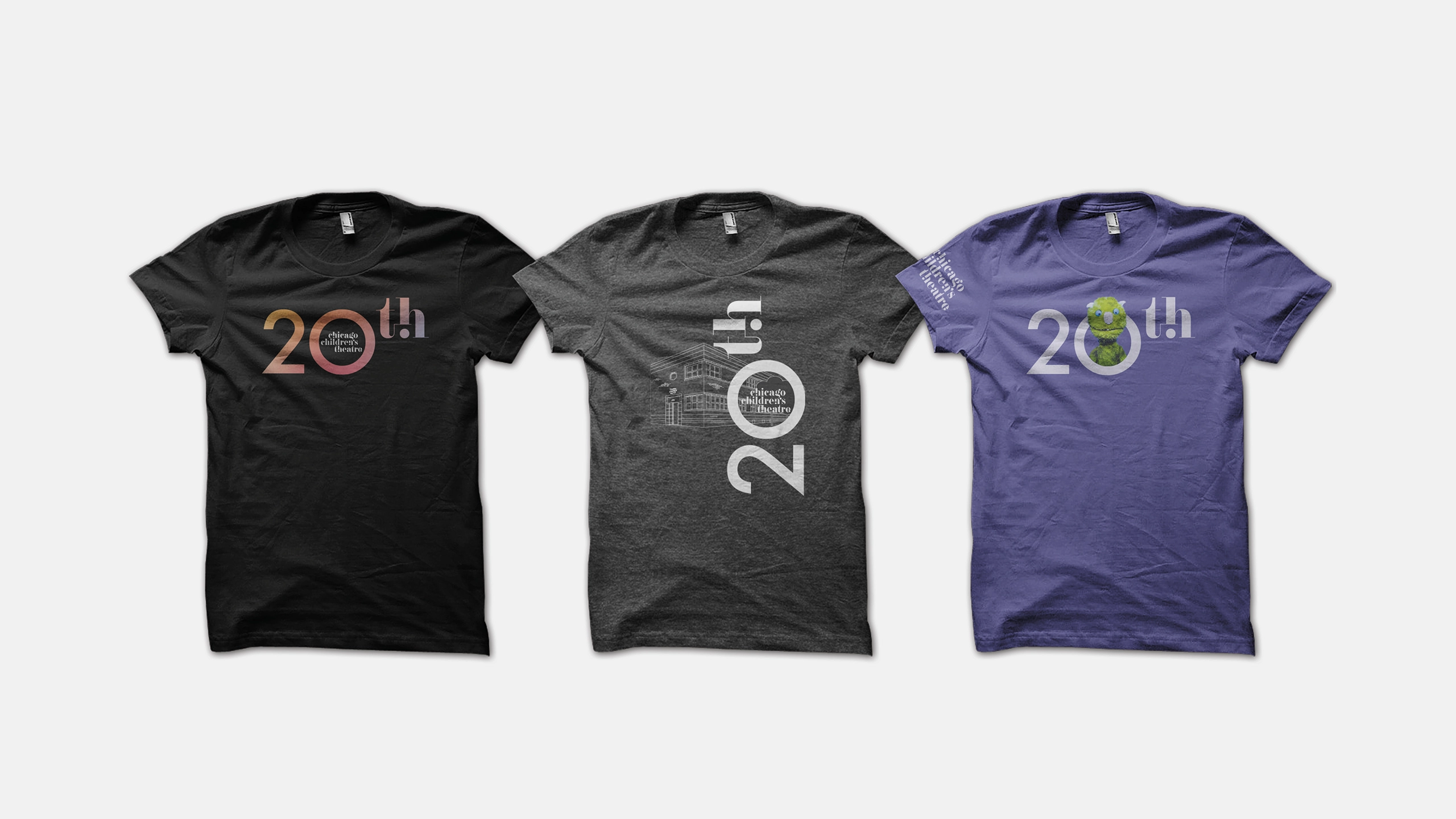
The 20th anniversary campaign included merchandise, programming promotion, and signage, which all led up to the year-end, star-studded Gala celebration.

Bus stop poster for Chicago Children's Theatre of "Goodnight Moon" with a rabbit in a rocking chair against a large moon backdrop for
Three posters advertise Chicago Children's Theatre plays. From left to right: "Frederick" with a mouse, "The Beatrix Potter Holiday Party" with a rabbit, and "Goodnight Moon" with a bunny on a rocking chair under the moon. Each poster includes play dates and a QR code.
Sign for "Chicago Children's Theatre" above the venue's entrance with vibrant, colorful letters on a dark background.