Dubbl Worldwide / Brand Strategy and Product Launch

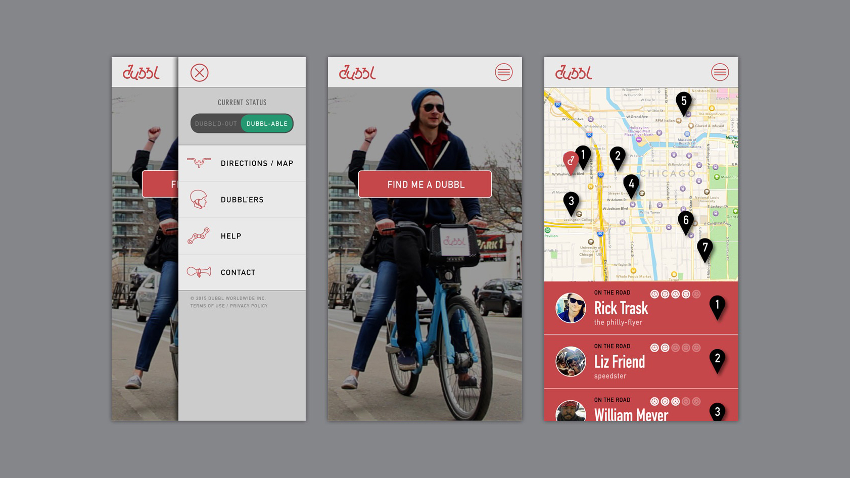
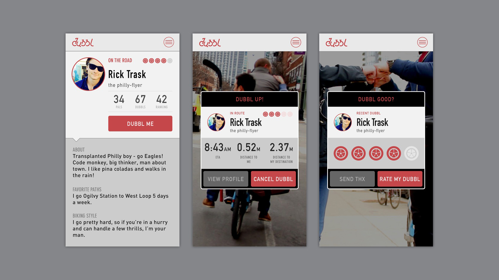
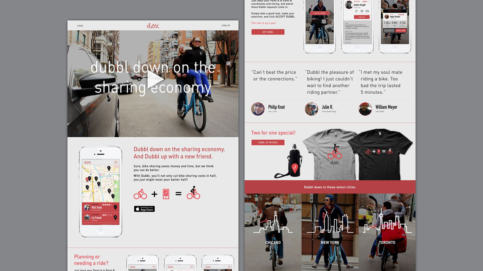
Dubbl down on the sharing economy.

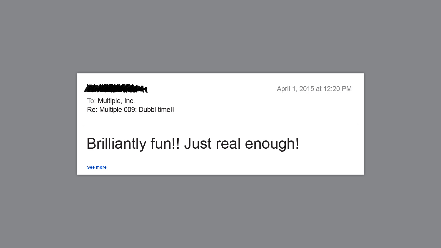
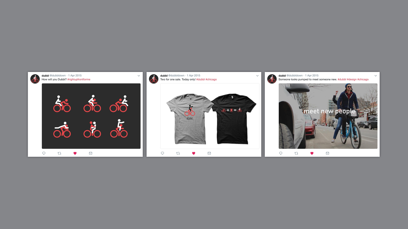
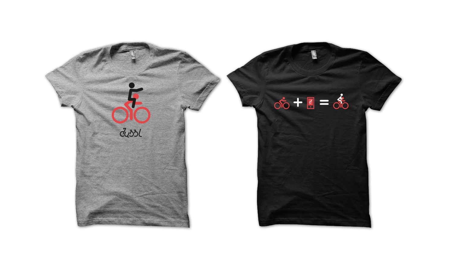
We take design seriously, but we’re not above using our powers for a little fun once in a while. Especially around the first day of the fourth month in any given year, if you know what we mean. This one had more than a few people reaching out to congratulate us on a great business idea beautifully executed. We let them down gently.

The Dubbl logo in white on a dusty red background
An email screenshot dated April 1, 2015, at 12:20 PM with the subject "Re: Multiple 009: Dubbl time!!" reads: "Brilliantly fun!! Just real enough!"
The Dubbl mobile app interface showing three screens: a rider on a blue bike, a menu with map and contact options, and a map with numbered location pins.
Three app screens from Dubbl showing a profile for Rick Trask, a bike rider. The first screen displays profile details. The second shows ride progress. The third allows rating the ride.
Website layout featuring a bike-sharing app theme, Dubbl. A man riding a bicycle is the central image. Below, app screens, user testimonials, and branded merchandise are displayed. Cities like Chicago, New York, and Toronto are highlighted, promoting a sense of urban connectivity and community engagement.
Three social media posts featuring bicycle-themed items. Left: Icons of cyclists on black; Center: Two shirts with bike designs; Right: Person cycling in street, text reads "meet new people."
Man riding ride sharing a Dubbl bik with a red bag in a city street, passing a yellow taxi and cars, with the text "reduce bike lane congestion" overlaid.
Two t-shirts with the Dubbl branding are shown. The gray shirt depicts a stick figure on a bike with red wheels and the text "dubbl." The black shirt shows a bicycle icon plus an icon for the Dubbl app and it equals an icon with two people on a bicycle.